Tech blog Pocket-Lint have posted their preview of Halo 4 and accompanied it with some off-screen shots from the demo, including these two showing some of the game's menus:
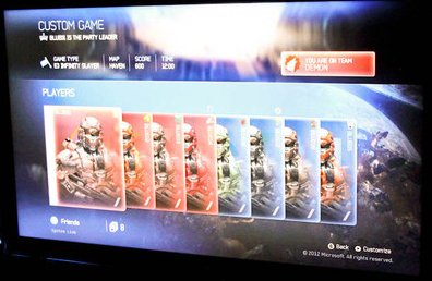
The two teams are laid out like playing cards. It looks like each card has the player's rank in the bottom right corner, emblem in the top right and then some other lines of text I can't read (presumably GamerTag and Service Tag). I don't think the menu is as pretty or elegant as the one in Reach, but I do really like that they show off the player's armour in the lobby like this - gives it much more prominence than it had in Reach.
Also worth noting is that box in the top right of the screen "YOU ARE ON TEAM DEMON". Clan names, maybe? Perhaps Red and Blue have been renamed Demon and ???
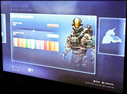
The other screen showed the armour customisation, you can select primary and secondary colours as we've come to expect - I haven't counted, but that looks like more colour options than in Reach.

Also of note is the emblem ("SPARTAN ID"?) which appears to be a man with the head of a unicorn. Is he playing a violin? Nun-chucks, maybe?


Recommended Comments
There are no comments to display.