-
Posts
140 -
Joined
-
Last visited
-
Days Won
2
Content Type
Profiles
Halo Articles
Forums
Events
Gallery
Books
Movies
Everything posted by Rayner Sutardja
-
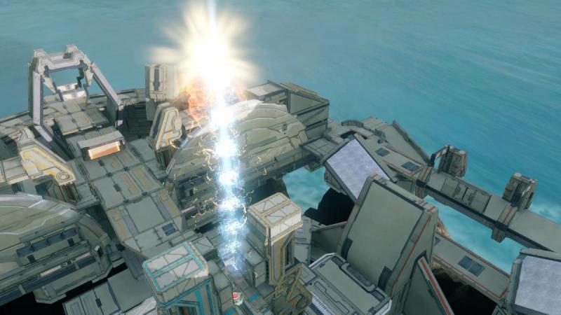
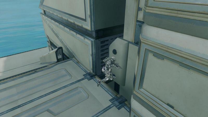
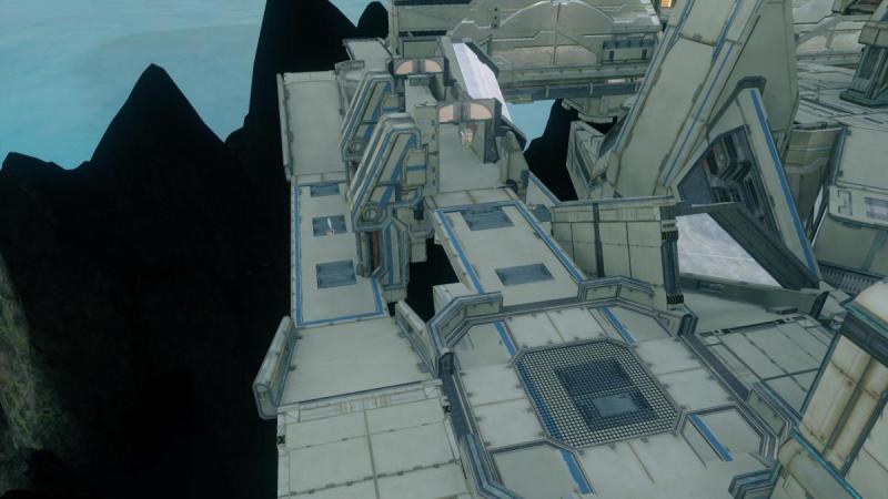
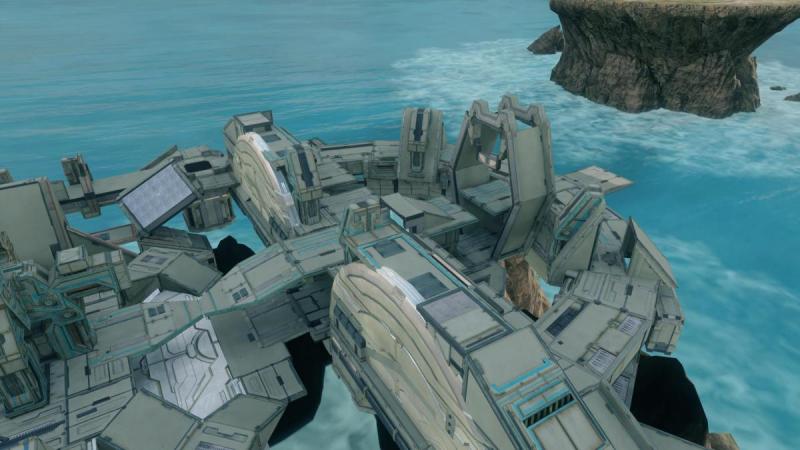
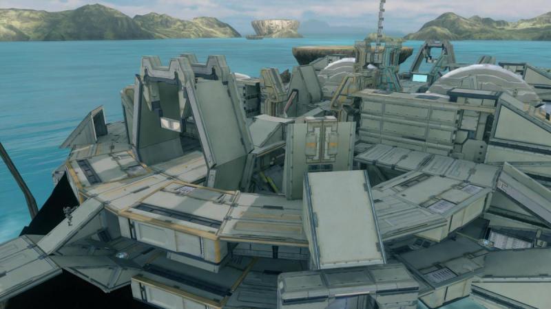
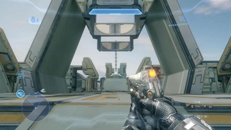
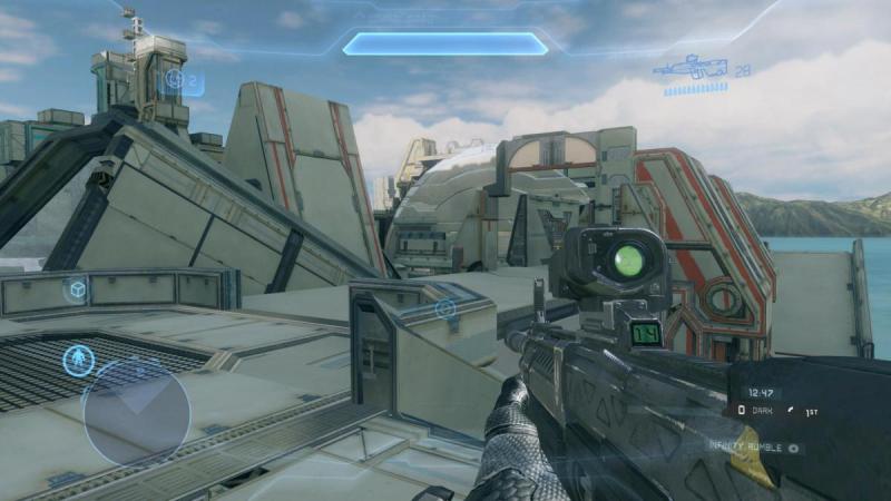
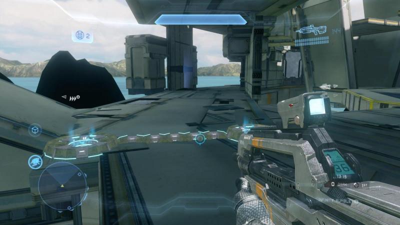
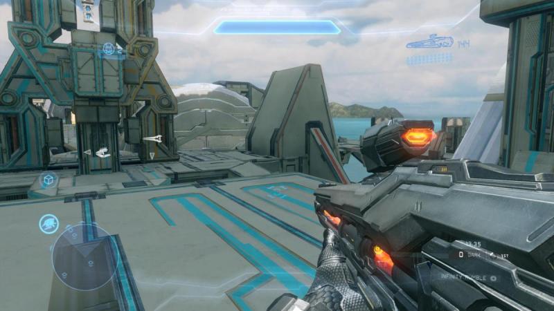
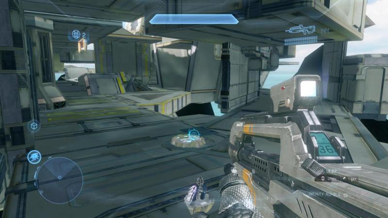
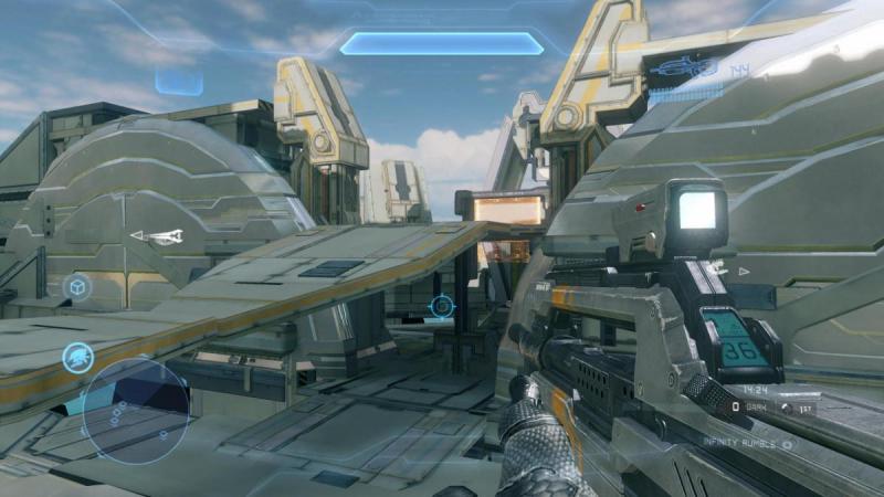
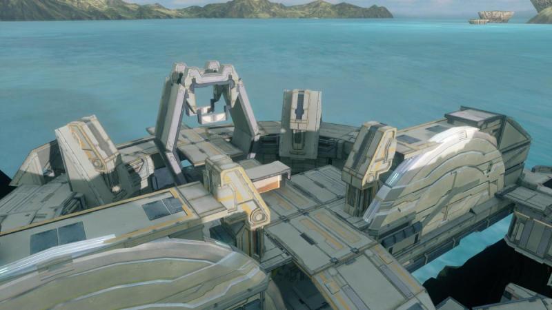
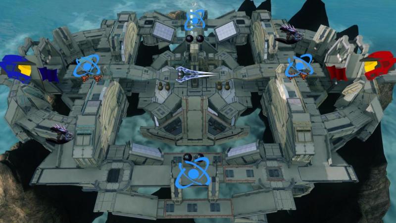
Gamertag: n0mnom321 Map: Beacon Players: 6-10 players. Recommended 8 players. Best game type: Slayer, Extraction, KotH link:https://www.halowayp...b7-fa8fee80b736 Weapon drops: 2x Needler 2x pulse grenade drops (2 per drop) 2x fragmentation grenade drops (2 per drop) 2x plasma grenade drops (2 per drop) Energy Sword Description Beacon is a competitive map for 6-10 players. It is a forerunner themed, 2-storey map that is centered around a "beacon" in the centre that is made of fusion coils and extraction crates that continuously detonates, making it look like a beacon (I think it is spectacular, but of course I'm biased lol ) There are 2 bridges, at the right and left of the beacon, and two main halves of the map, orange and cyan, which are the red and blue spawns respectively. There are many jumps, including the pyramid jumps between the bridges and the centre of the map, the artefact rim jump ( a jump to a narrow pathway jutting out from the artefact base-wall and jump back to the bottom-middle of the map) and multiple drop-downs and 2 gravity lifts at both halves (orange and cyan) of the map. The map is based off the design of haven but plays quite differently. Enjoy! Pictures: And here's the overview pic, I couldn't get a pure bird's eye view of the map as it is under the forge island and I am blocked by the ceiling.
-
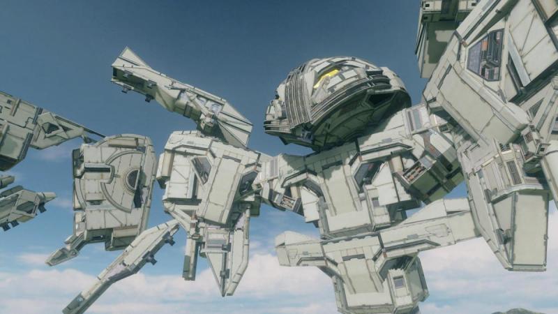
Hey guys, I have made an aesthetic-only version of the map (as suggested by Zandril), and it has added hovering rocks, just like in the trailer. It also has been very slightly tweaked in terms of wing positioning. That's all Here's the link to the map: https://www.halowaypoint.com/en-us/games/halo4/fileshare/details/451798fc-161c-49f3-ab3b-60a178b5ccdb And a few pictures:
-
Remember, these aesthetics that use weapons are not only limited to forge art. They can be used in competitive maps. Just pit a trait zone to disable weapon pickup
-
Great work, Zaelkyria, your competitive maps look just as cool as your aesthetic ones!
-
It would probably look better if there would be less colours and a floor made of wall, coliseums, and the map is a little too small, at least i can tell from the screenshots(even for 1v1s), but that's just me, and I'm not the most experienced forger at all. Good work and good luck!
-
Great use of the Impact base! I'm not too sure about the circular layout, though... and a longer description would be nice
-
Congrats on the feature Zandril! Glad all that work paid off! And thanks for helping me along too!
-
Your maps look unique, albeit crude, but if that's your style, that's cool... I'm not going to comment on the map design or anything, because I'm not really a competitive forger. But your video is not very informative, your screenshots mostly showed action scenes, rather than showing off portions of the map, routes, rooms, etc... though you had some good screenshots, i would recommend posting them on the post itself because little people will actually watch the video. Your description is also a little short. But anyways, keep going< and good luck!
- 1 reply
-
- 1
-

-
- INSTALLATION 01
- PARADOX
-
(and 1 more)
Tagged with:
-
Thanks! Good work yourself, Zaelkyria!
-
Zaelkyria, I really admire your work. Good job!
-
Of course. What I meant is that the picture doesn't do the post any good, not the map. My bad. The post would look nicer without it in my opinion, but would look nicer with a good picture that shows most of the layout as the bird's-eye view of the map does not show much. You know, just for other viewers and possibly attracting more feedback... sorry, I don't want to argue in this forum. Perhaps, you can remove the wall, coliseums on top just to take a good look at the layout before putting them back and then you can also use Zandril's halo 4 marker pack to mark out spawns and whatnot. People are busy, this will help this post out by making it easier to comment on weapon locations and vantage points in the map as they have a clear view of the layout. Even though downloading the map and giving feedback that way is more effective, some people don't have the time. Look, I'm just trying to help. Just a suggestion
-
It looks pretty cool, but from the video i can see you being spawn killed over and over again; you should probably add more spawns or decrease the effectiveness of the top platforms, the sightlines are way tpo long. I'm no expert, but I see no reason to go to the bottom parts of the map when they are so risky, even the railgun, which doesnt seem to spawn often is ealisy accesible by dropping down from the top. Just add some cover and your map will be changed. The concussion rifle too, you should place it below the map. At least for now, it seems like the top is too powerful. Those are the issues i can see from the gameplay but the map definitely can be improved to be a great map!
-
Its one of the impact bases, I think... the top of the 2-storey one... Anyway, cool map, from the screenshots, it looks very clean and crisp! I'm no expert, just offereing my 2 cents worth, but I don't think the overview picture does your map any good as most of it just shows the ceiling and makes it look messy with all the pieces sticking out, even though it looks very good and smooth from the inside. You should probably change it with a picture in the highest corner of your map that shows most of the layout.
-
Great work salasandro! I would love to see a feature for this awesome map!
- 9 replies
-
- generator
- ion cannon
-
(and 7 more)
Tagged with:
-
Thanks!
-
Oh, I think I remember playing CTF here. It looks awesome, but a little flat? I don't know, but i think you should add more height variation other than that, great work!
-
-
Cool, but it should be on competitive map submissions. If it is an aesthetic map, edit your description because it says "4v4 slayer" there. Cheers
-

Halo 4 Miniature Covenant Battle cruiser
Rayner Sutardja replied to LANK3Y PROZz's topic in Aesthetic Maps
Awesome! are the plasma pistol things supposed to be banshees? if so, you should totally put plasma grenades as the frontal bulbous section. -
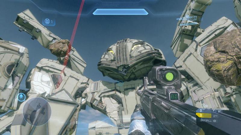
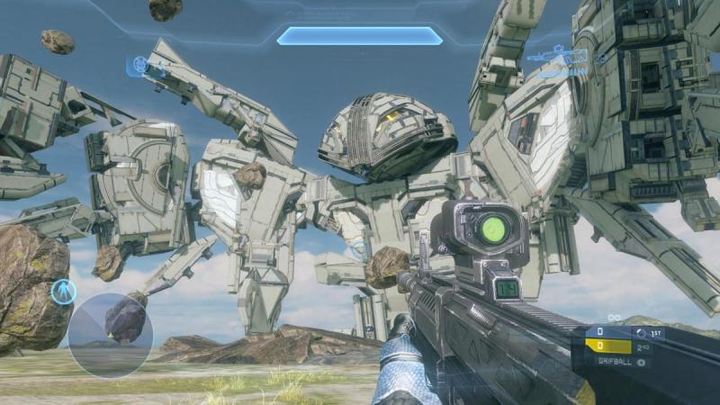
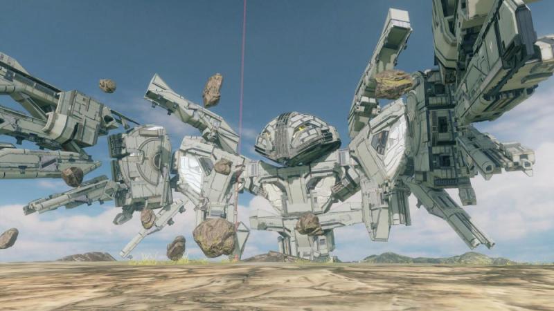
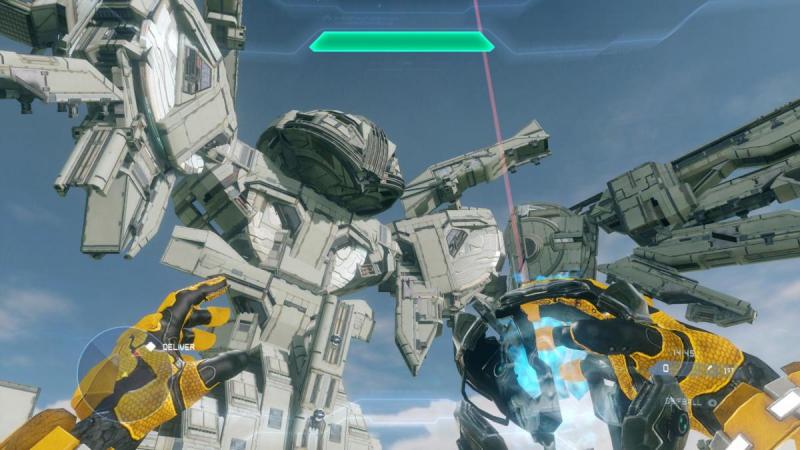
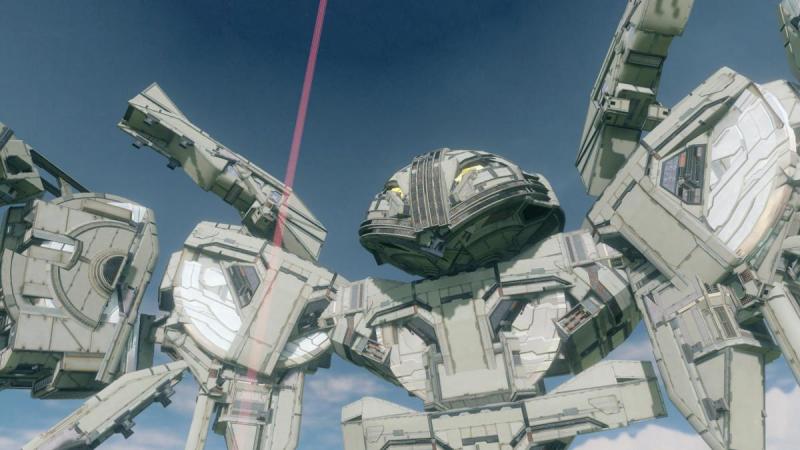
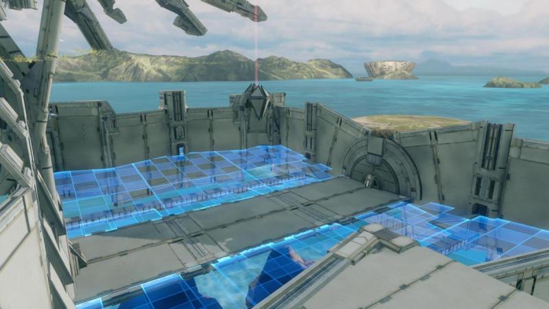
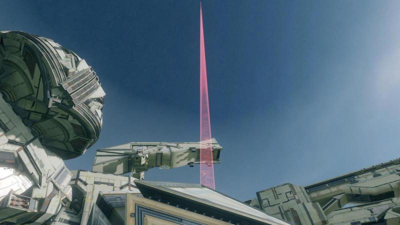
GT: n0mnom321 Map Name: WingBlade: Grifball link: https://www.halowaypoint.com/en-gb/games/halo4/fileshare/details/e451f294-fedc-4548-acae-29fdd0b83395 Wingblade is an aesthetic/grifball map featuring the robotic phoenix/bird in the Halo Xbox One trailer. It is fully compatible with grifball. The grifball court is underground, but the phoenix is aboveground. If you want to see the phoenix up close, change to gold team, as the respawn point of the gold team is aboveground. The beam coming out from the centre of the map is visible in any grifball game, adding that nice forerunner feel to the map, due to a glitch that when any object with a zone is labeled as grif_goal, the zone will be visible. It does not affect the game as it is not assigned to any team. I hope you like it! Prepare for awesome! I like the forge island pallet as the colour of the artefact bases are able to blend in with the greyish pieces better than the paper-white pieces of the other 3 maps. Older version (tell Me which looks better)
-
love the water cooler. nice use of the energy sword. absolutely requires a feature.
-
That is so cool! But i don't know why, if you put artefact bases next to UNSC pieces, it seems more obvious that the object is made out of UNSC pieces. I like leaving the artefact bases out sometimes because they change up the colour too much. Go for the grey, massive floating structures of halo 1,2,and 3, not the silver of halo 4, then the only piece you can use to colour your map will be the artefact bases.
- 2 replies
-
- Aesthetics
- Forerunner
-
(and 1 more)
Tagged with:
-
That is AWESOME. I wanted to make it on forge island but the circular ramp pieces are now in the buildings section. :-( I hope this gets featured, great job. How long did it take? Oh, also you should make it into a grifball map. Place a court below it. The kill zone which is your beam, if labeled grif_goal, it will be visible in-game! It wont affect your gameplay unless you assign it a team, so don't worry.
-
Wasn't this featured in pokephile's channel? I don't know, maybe it's just the bridge that it the same. Yep it was featured by pokephile.


